FITTER FASTER BETTER
PROJECTVERRUE PERSONAL TRAINING
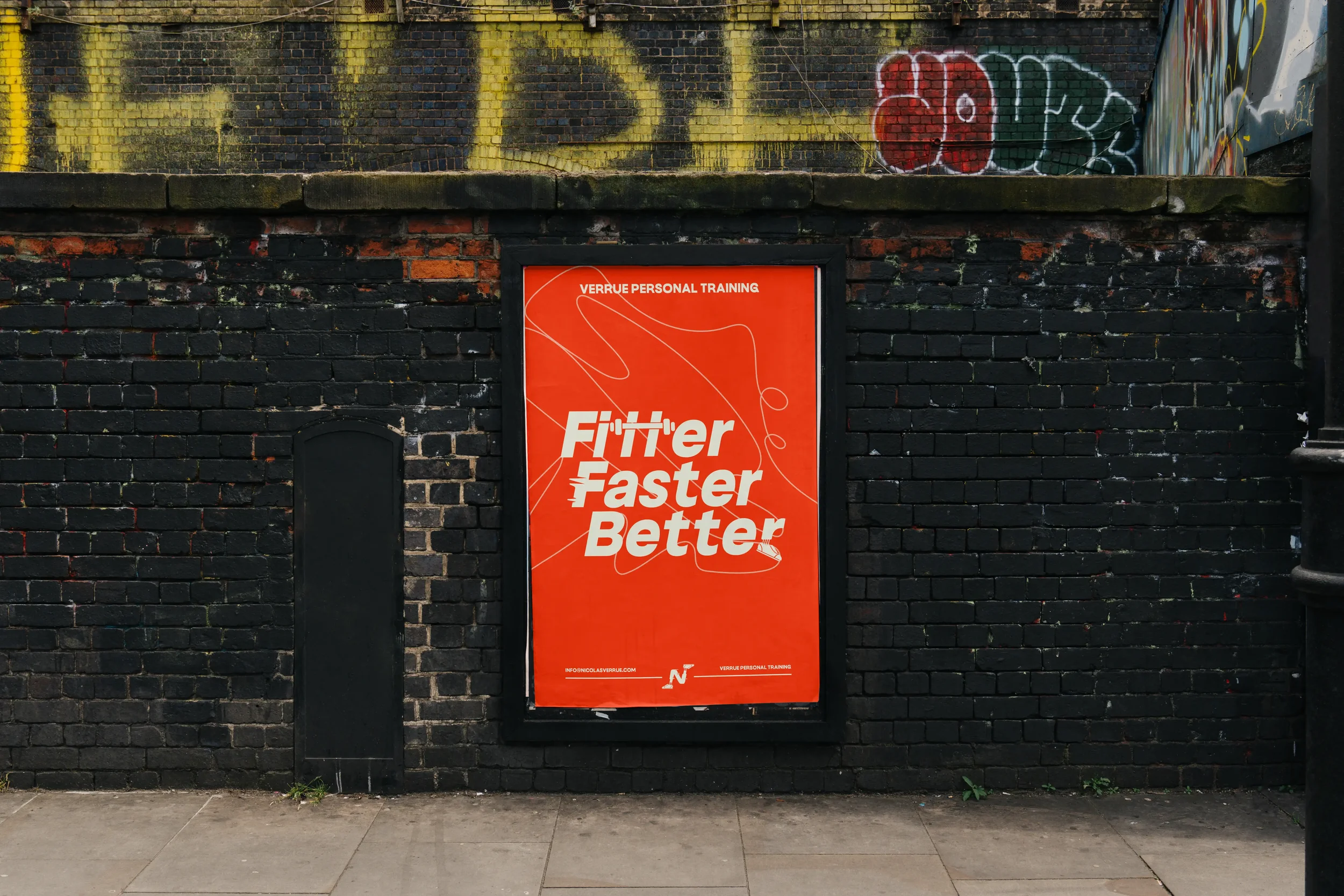
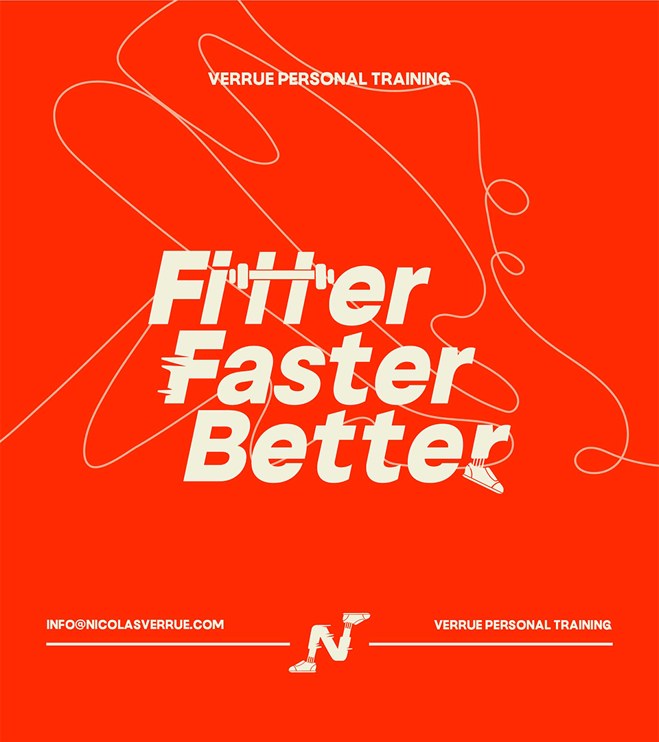
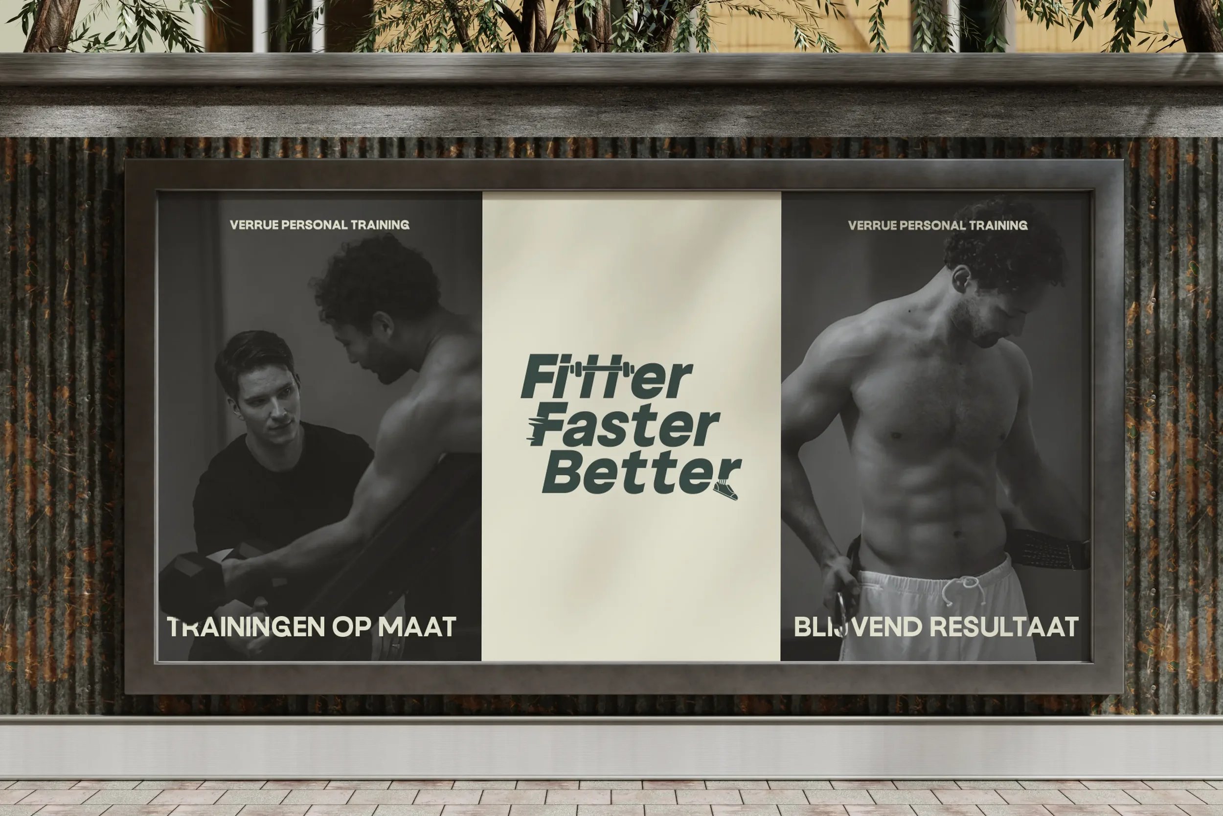
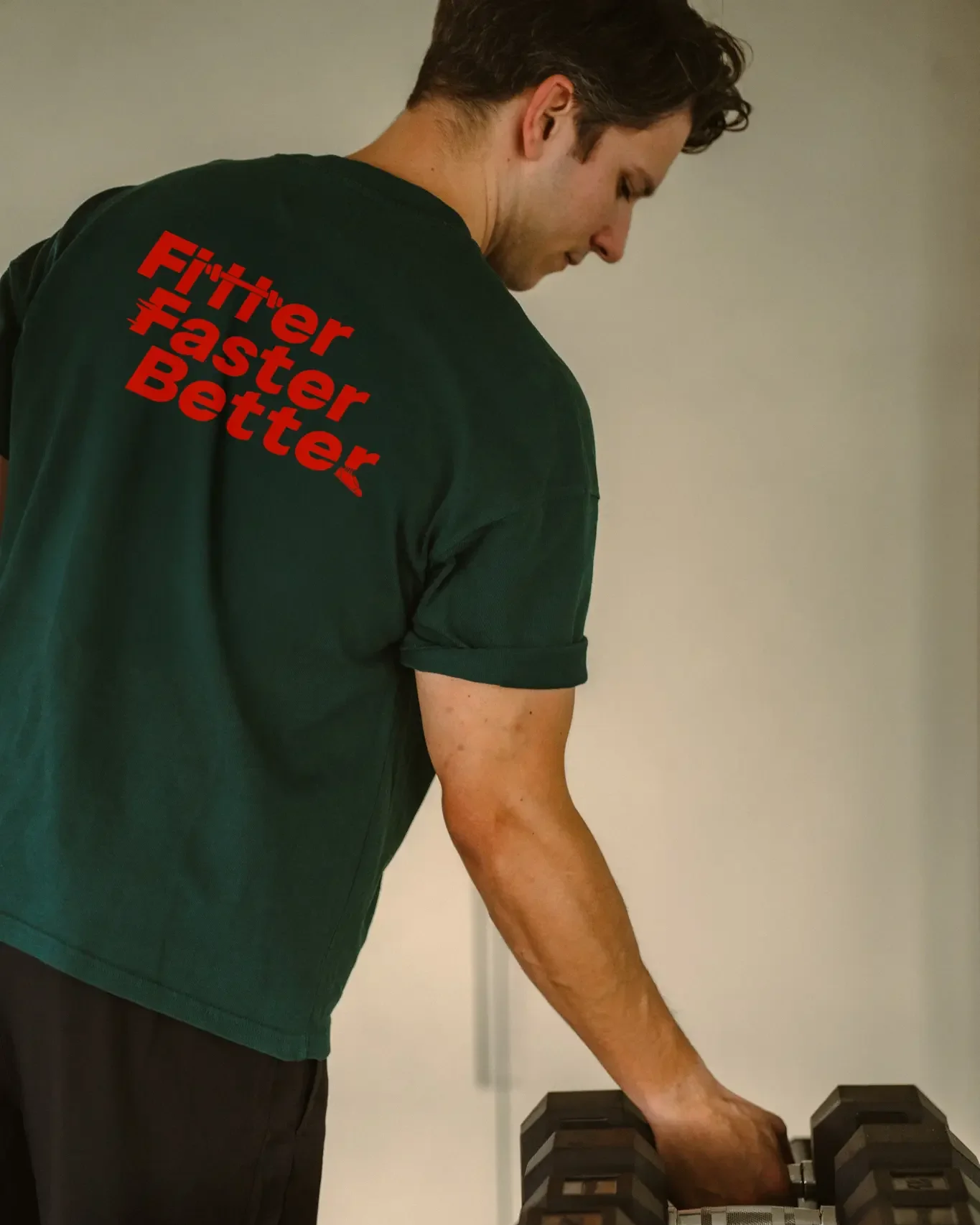
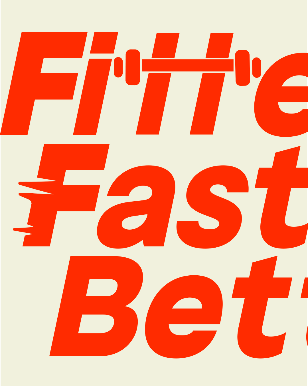
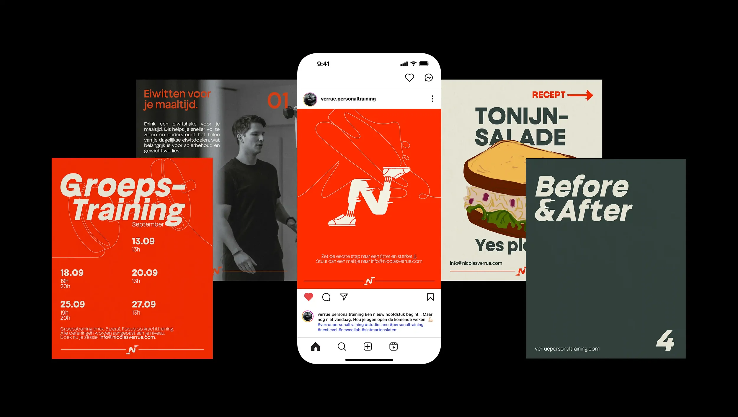
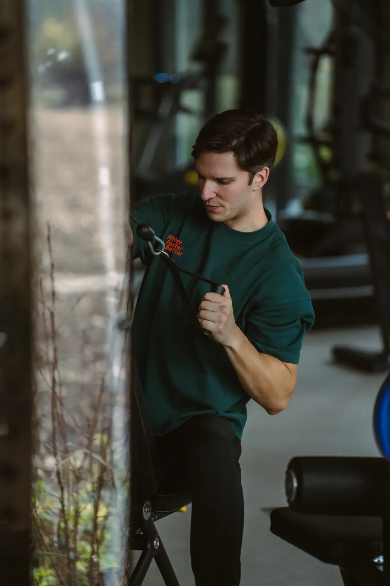
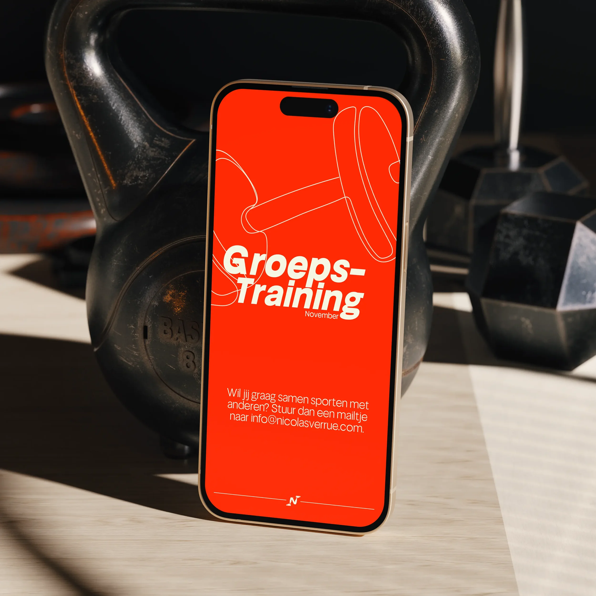
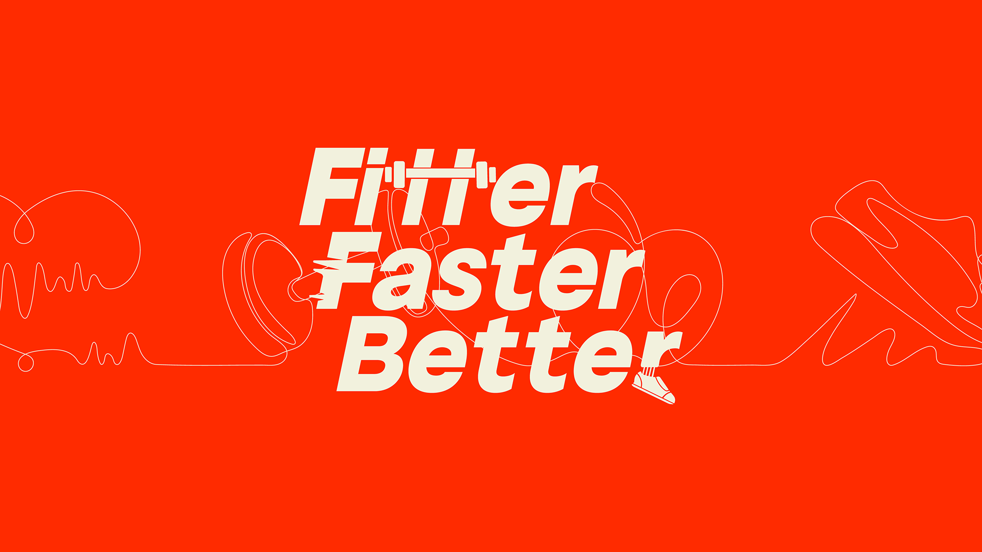
With the move to his new training studio, Verrue Personal Training needed a campaign to boost visibility online. I created a Fitter, Faster, Better campaign to show that health is about personal, effective, and long-term habits.
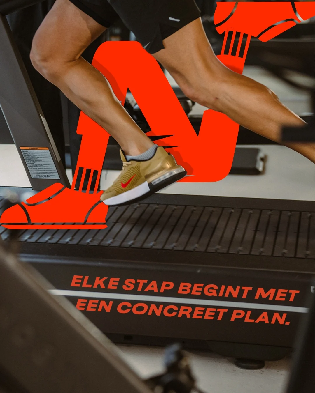
The system, designed mainly for social media, features bold, playful sport elements that make the graphics versatile for posts, merchandise, and posters. Combined with line-art icons (heart, dumbbell, apple, and shoe), the visuals bring the campaign to life.
Photography by @jeremivds
STRATEGIC CAMPAIGN
SOCIAL MEDIA
VISUAL STORYTELLING
Motion Design by Morgane Verrue
