Comalats
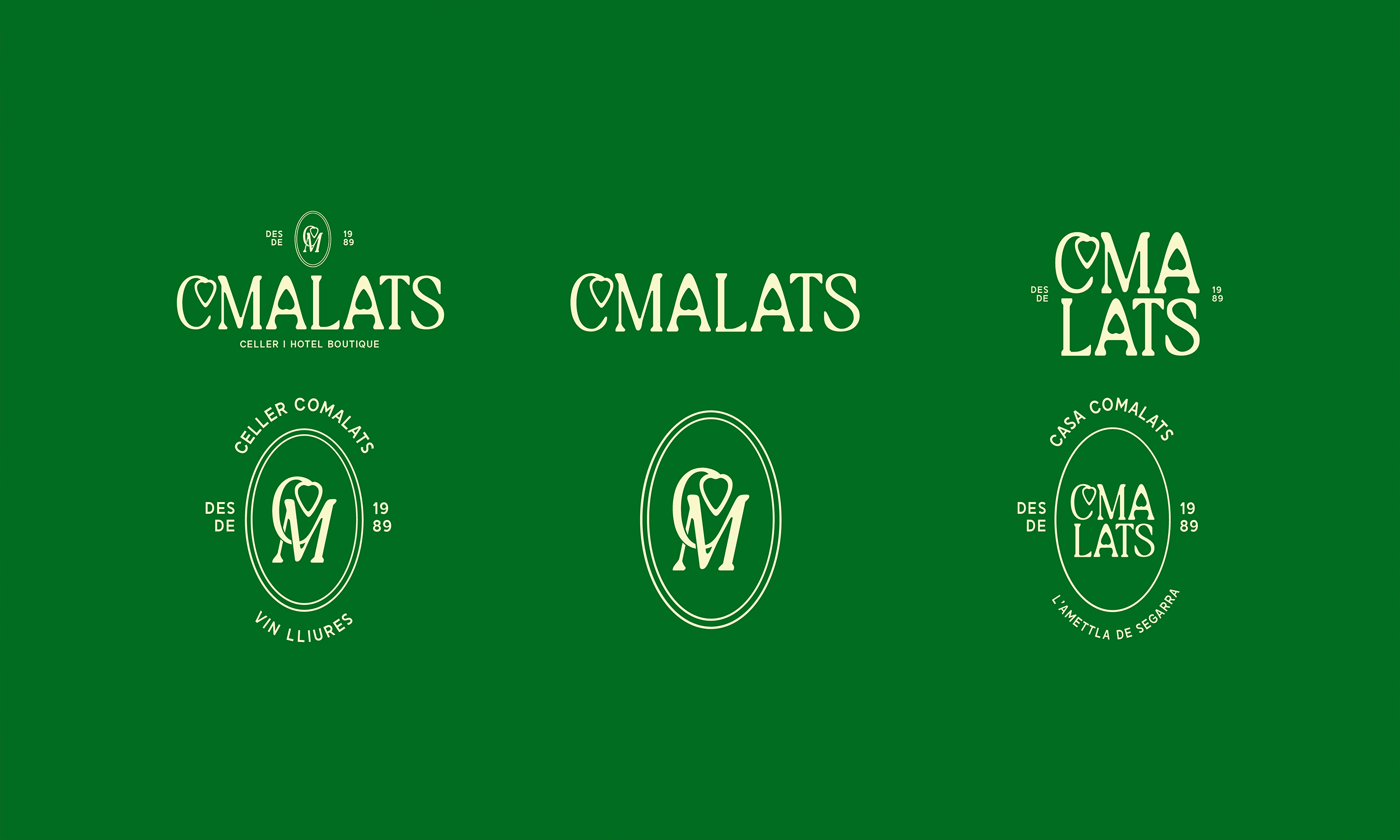
A full rebranding of Comalats, a Catalan family winery that has been making natural wine in its own cellar for generations. Deeply connected to the land and guided by family tradition, Comalats celebrates the craft of honest, hands-on winemaking.
The Approach
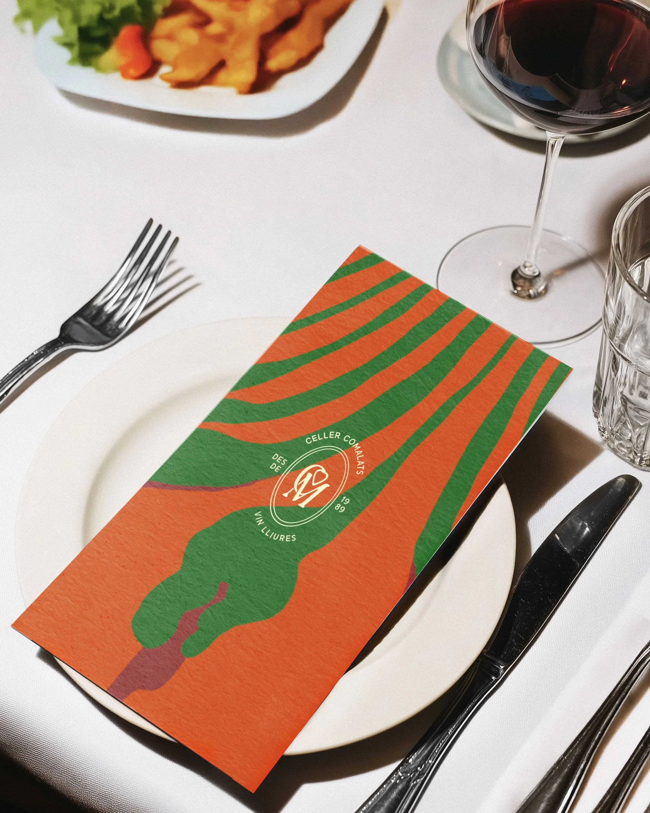
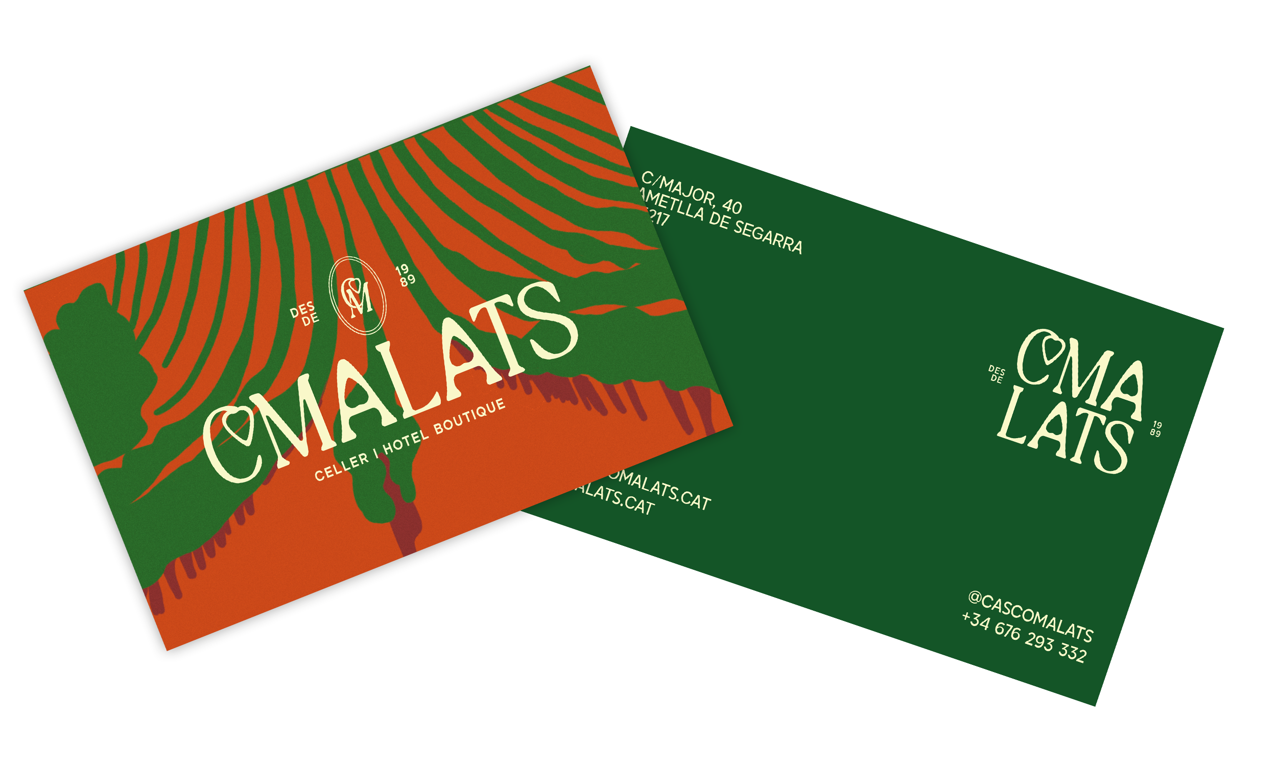
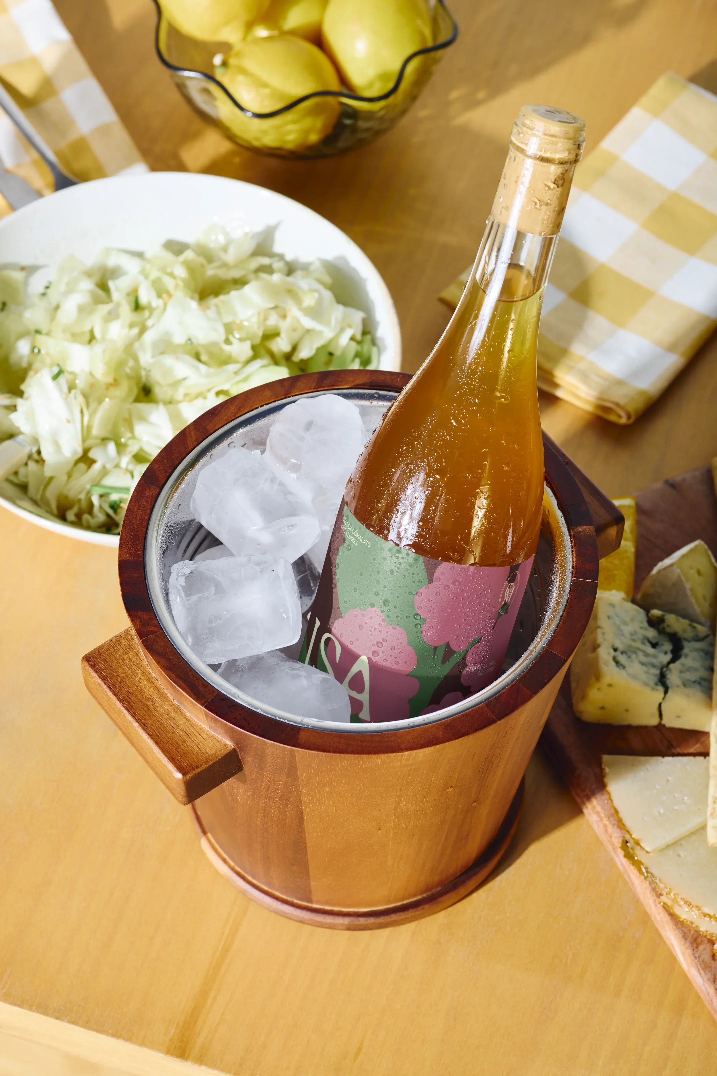
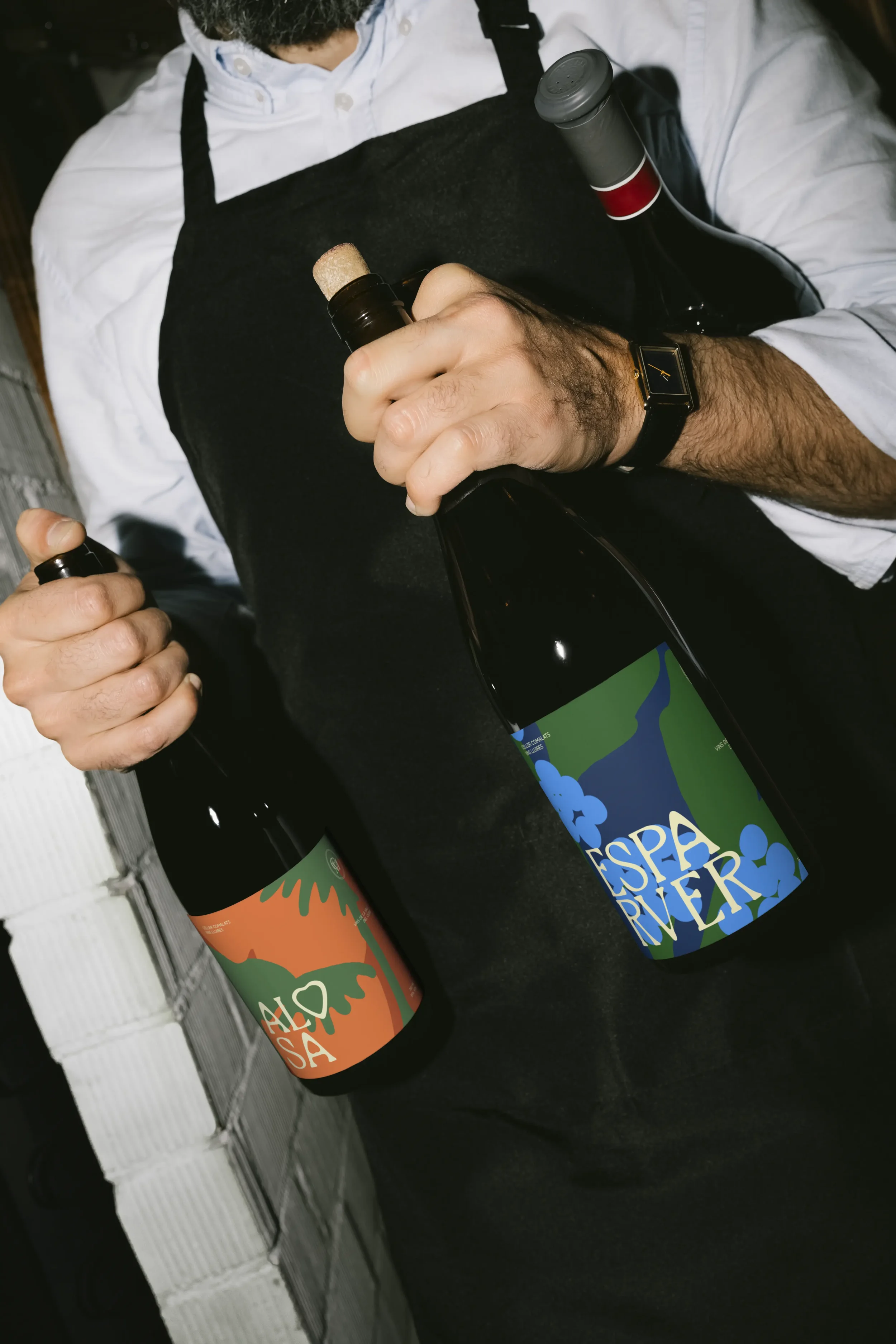
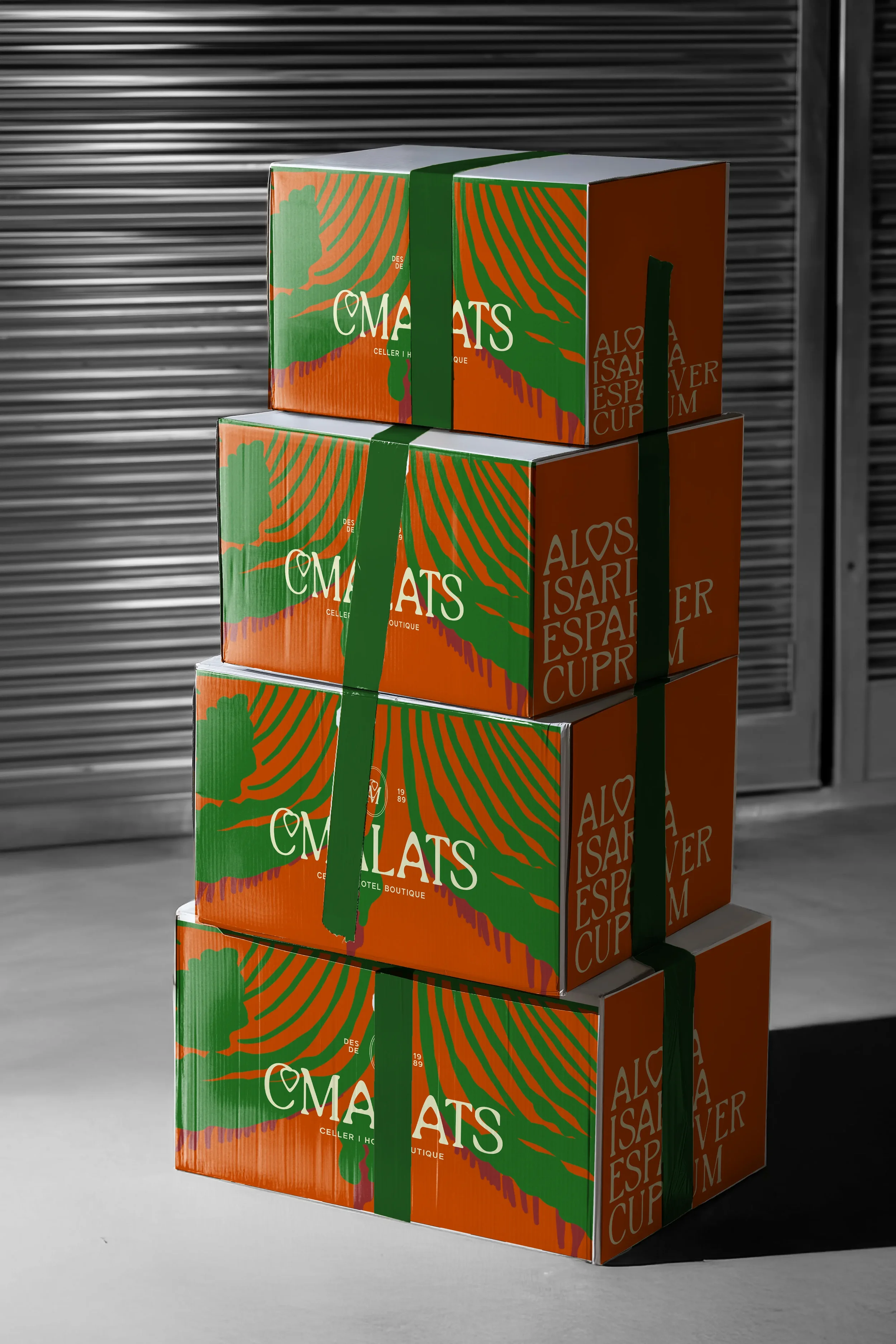
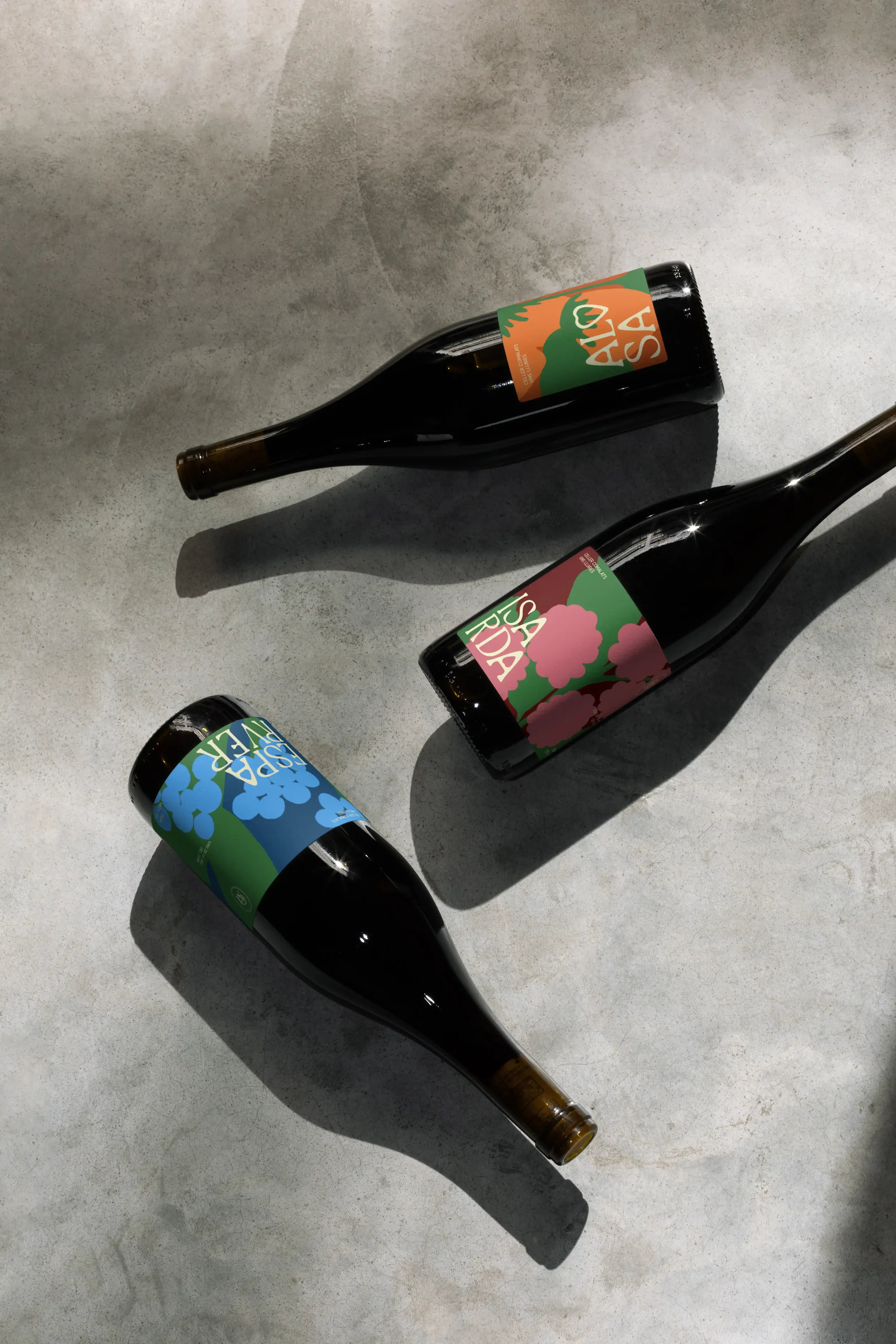
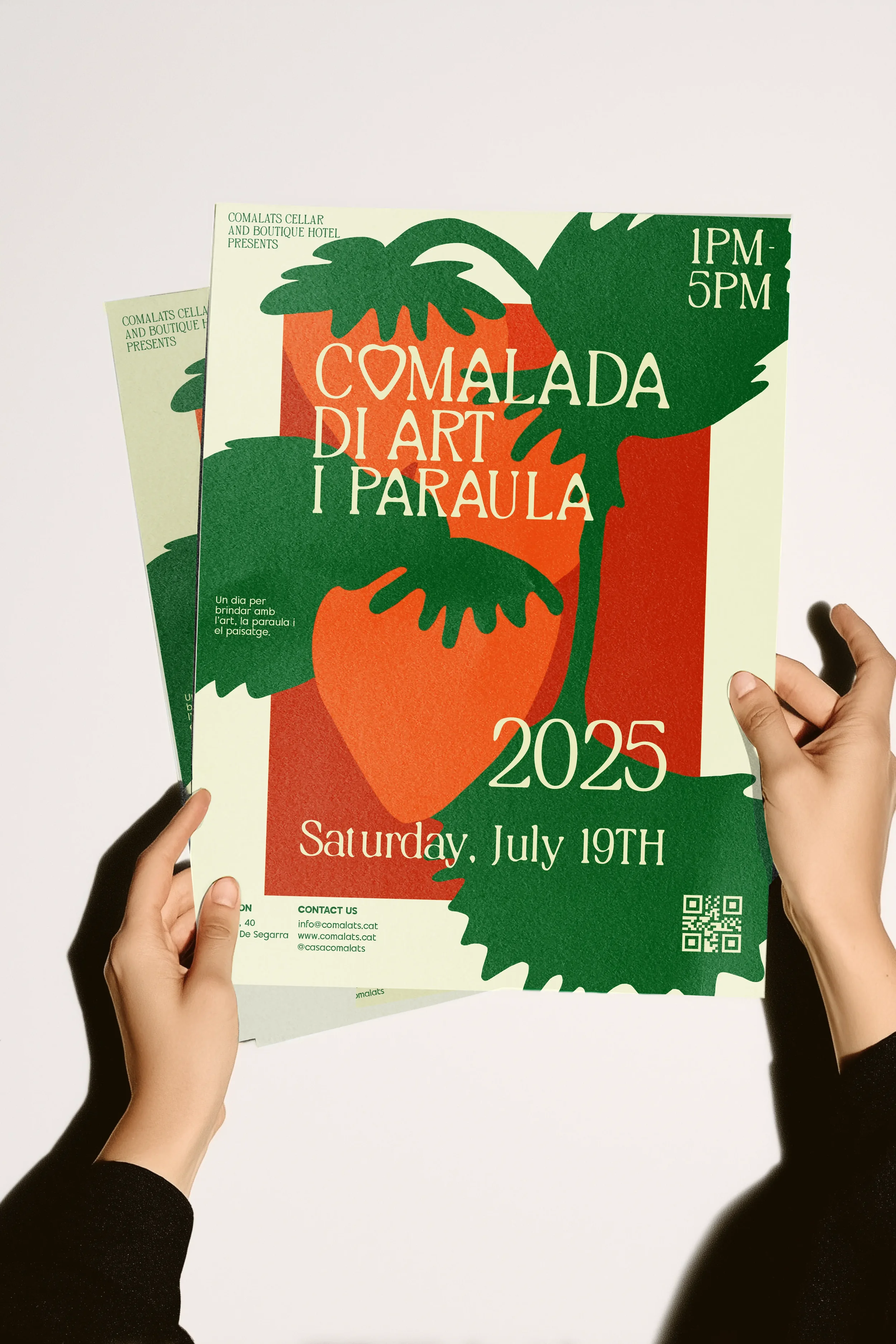
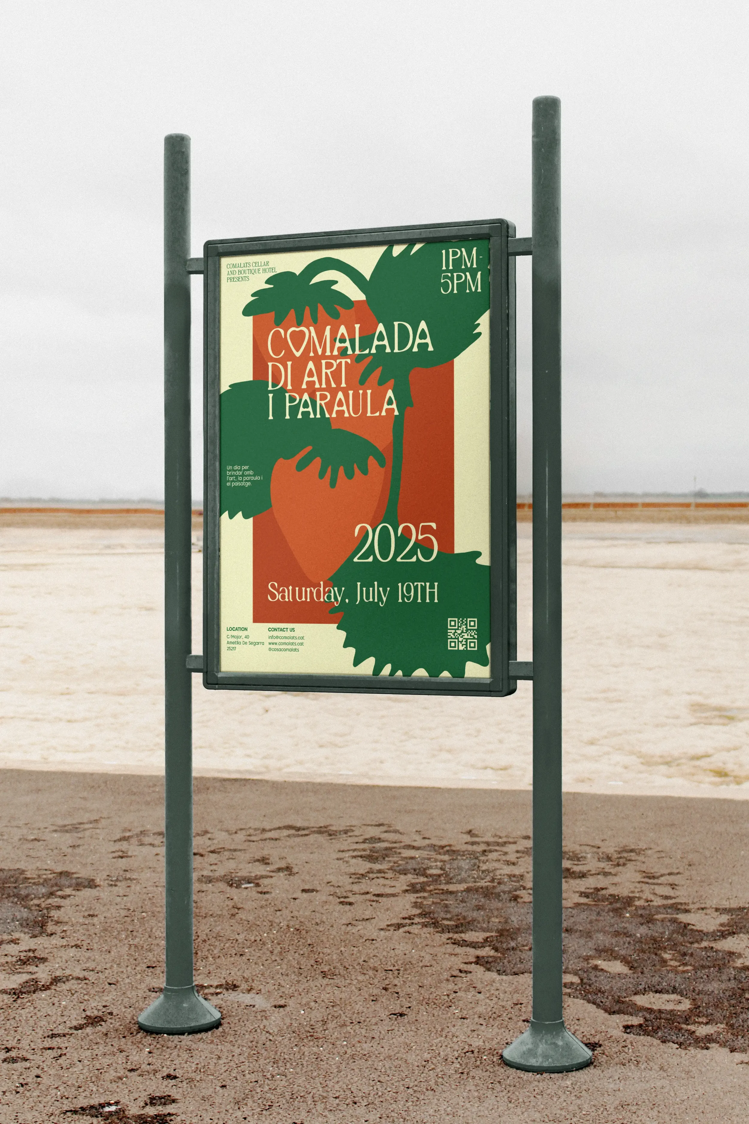
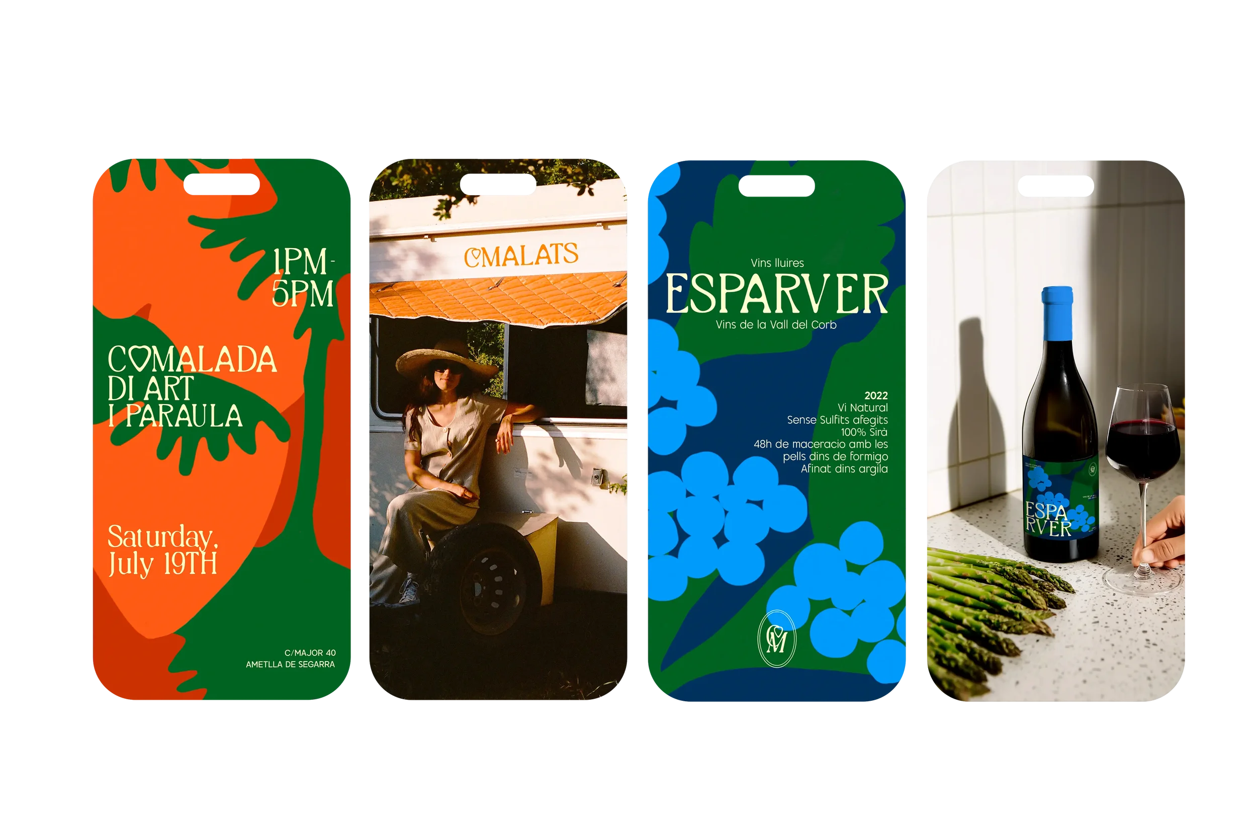
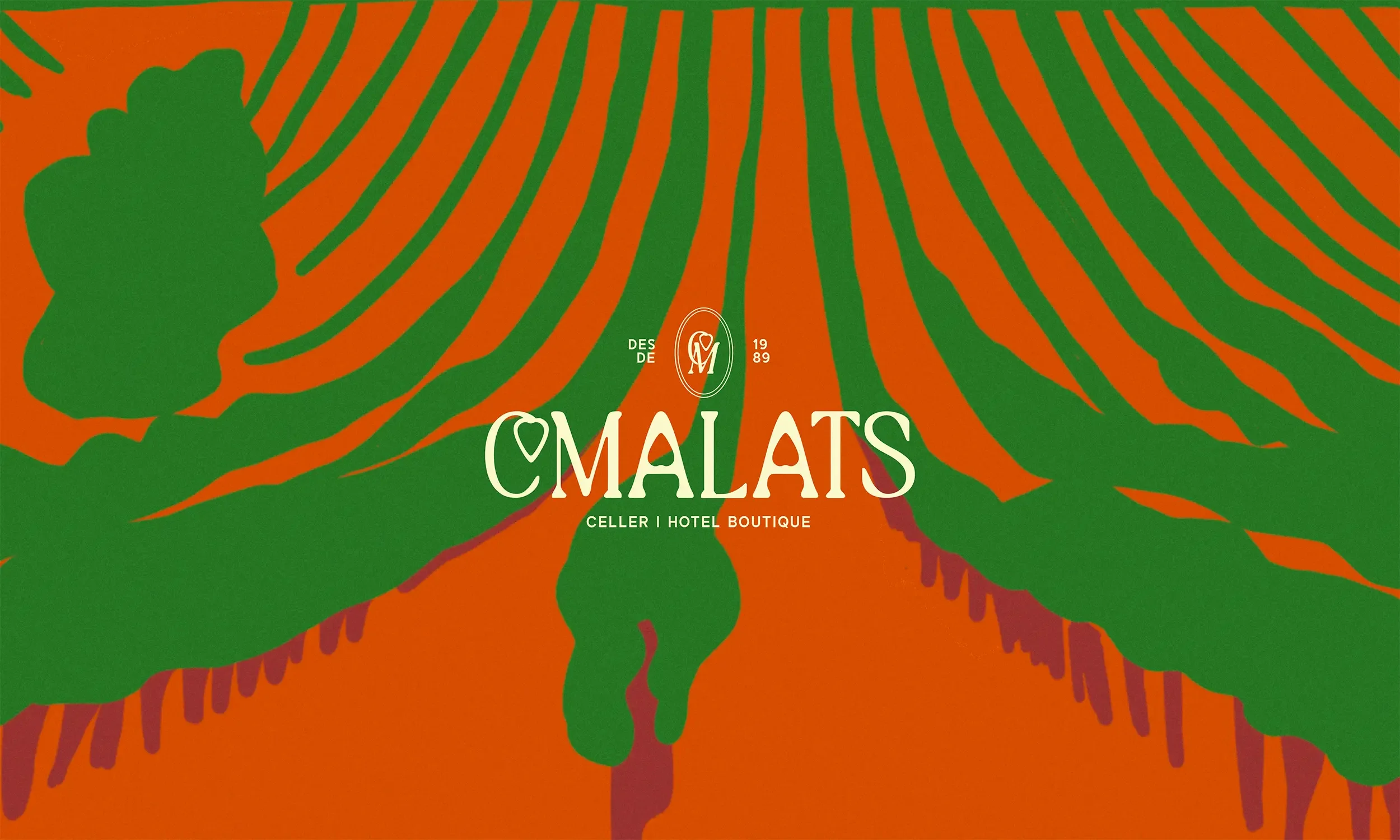
The rebranding uses a slab serif font to give the wines a touch of luxury. Hand-drawn illustrations highlight the craftsmanship and personal care behind each bottle.
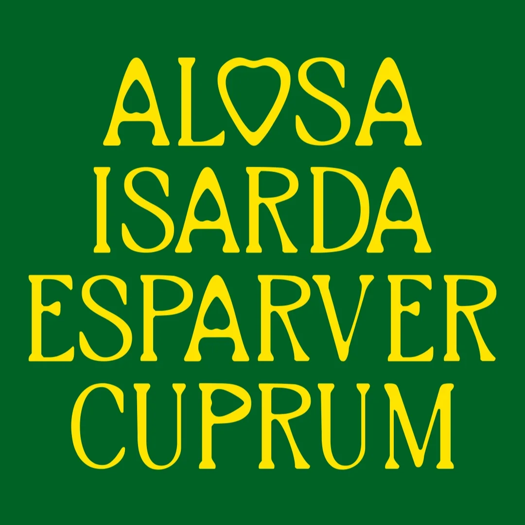
Typography plays a key role in balancing tradition and modernity. The serif typeface feels classic, rooted, and timeless.
The hearth symbol represents family, passion, and authenticity. It also represents the fruit of their work. It reflects the human side of Comalats and their deep love for the land, the vineyards, and generations of winemaking in the La Vall des Corbs region.
The Challenge
The goal of the Comalats project was to create a timeless brand for a family-run, eco-friendly winery that is closely connected to nature. The new identity needed to reflect the family’s heritage while staying simple and lasting.
For the wine labels, the aim was to show the uniqueness of each wine and highlight their level of exclusivity, while keeping the natural, handcrafted feel of Comalats.