STILL WOOZY
PROJECTLOVE SEAT ALBUM
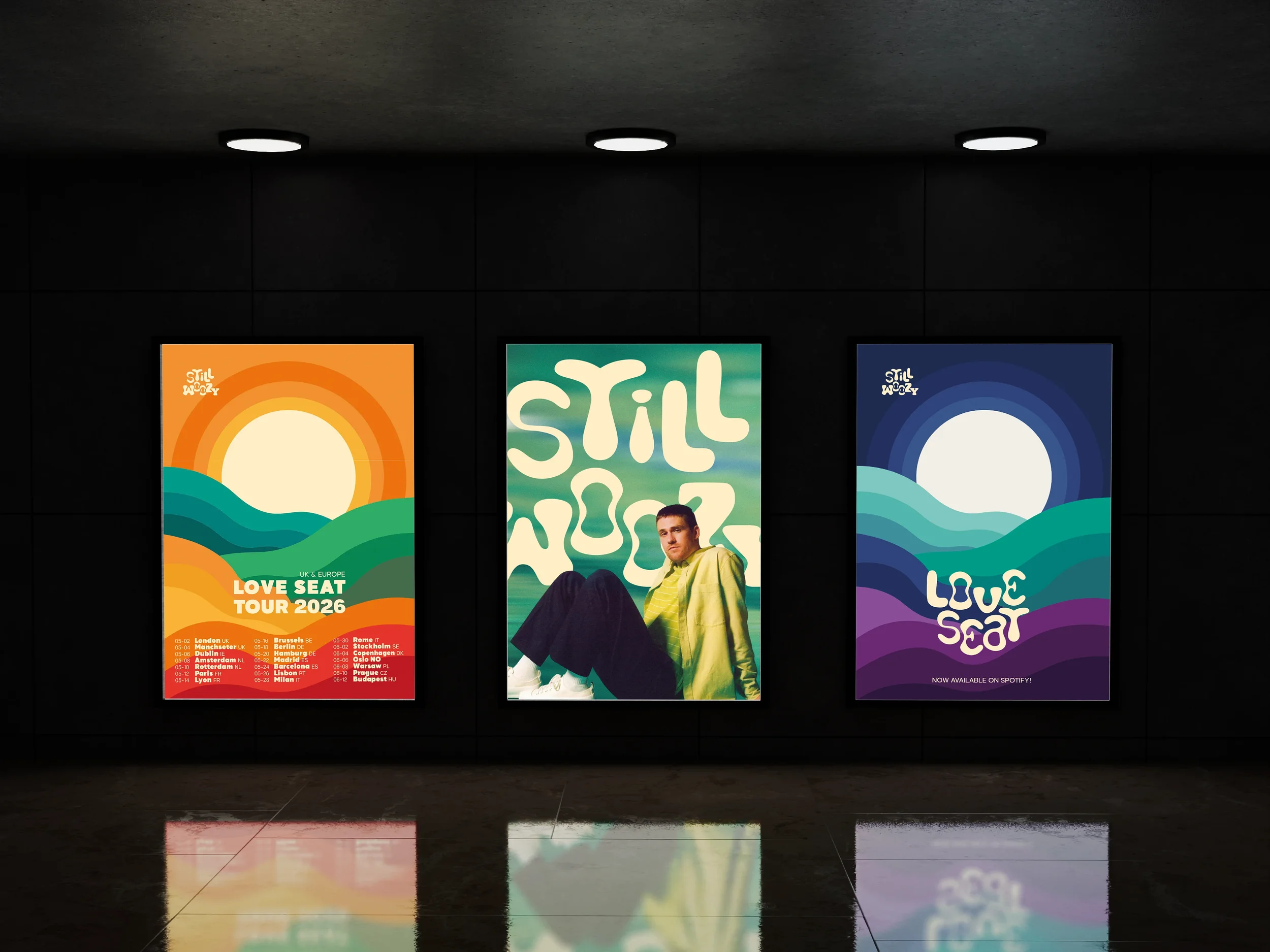
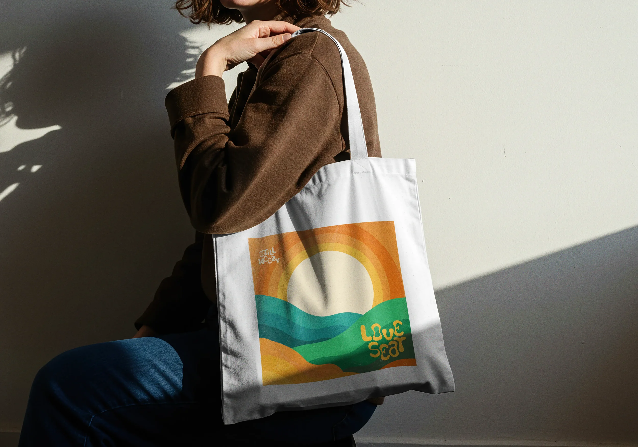
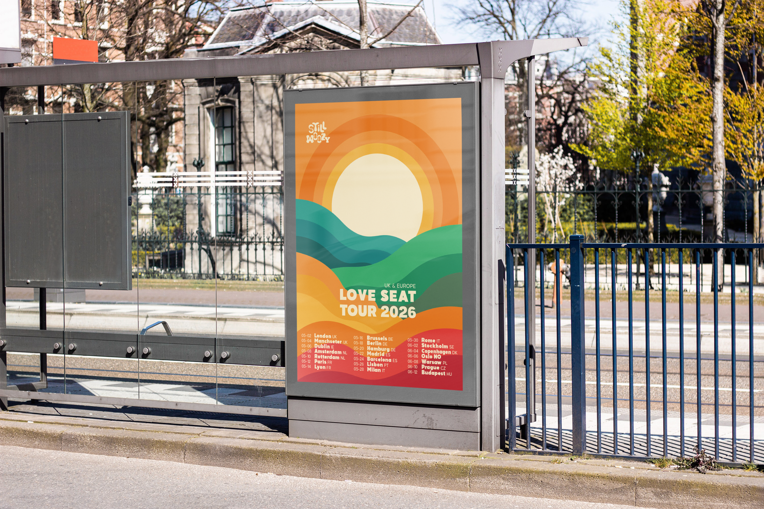
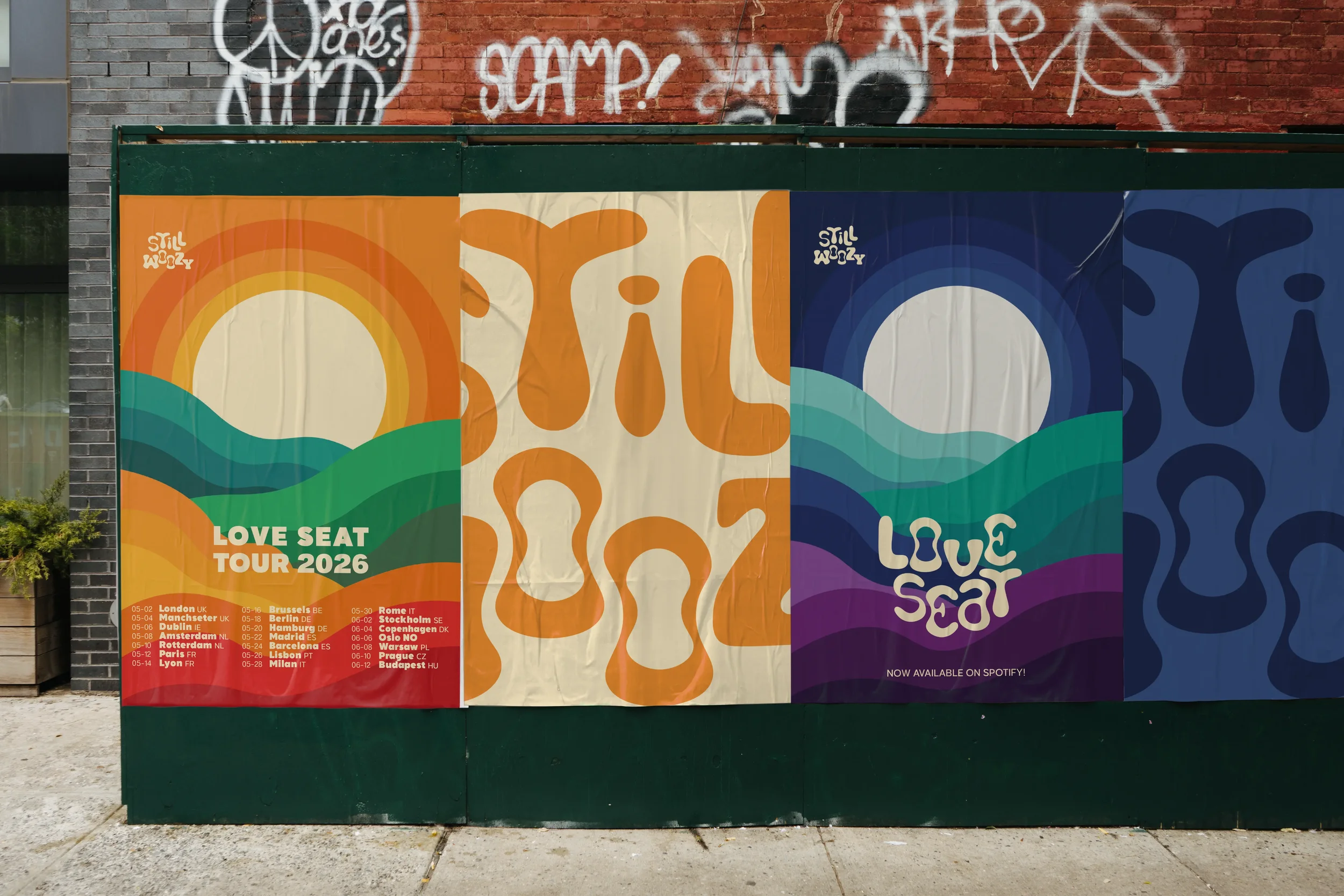
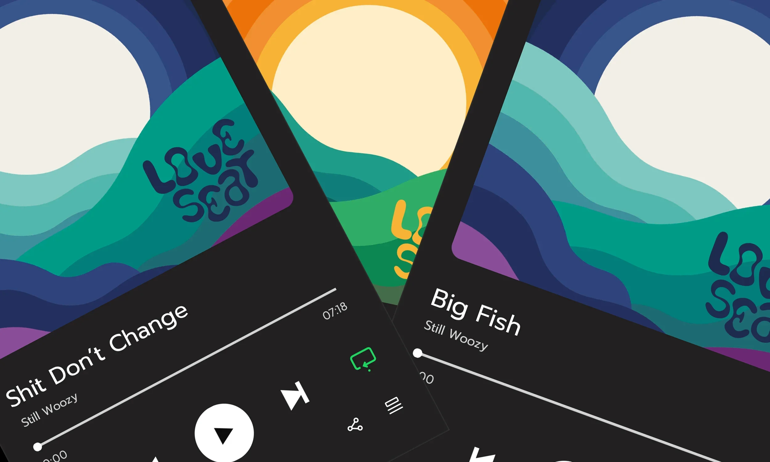
A visual identity inspired by Still Woozy’s Love Seat album. The design captures the contrast between day and night through an abstract sea landscape.
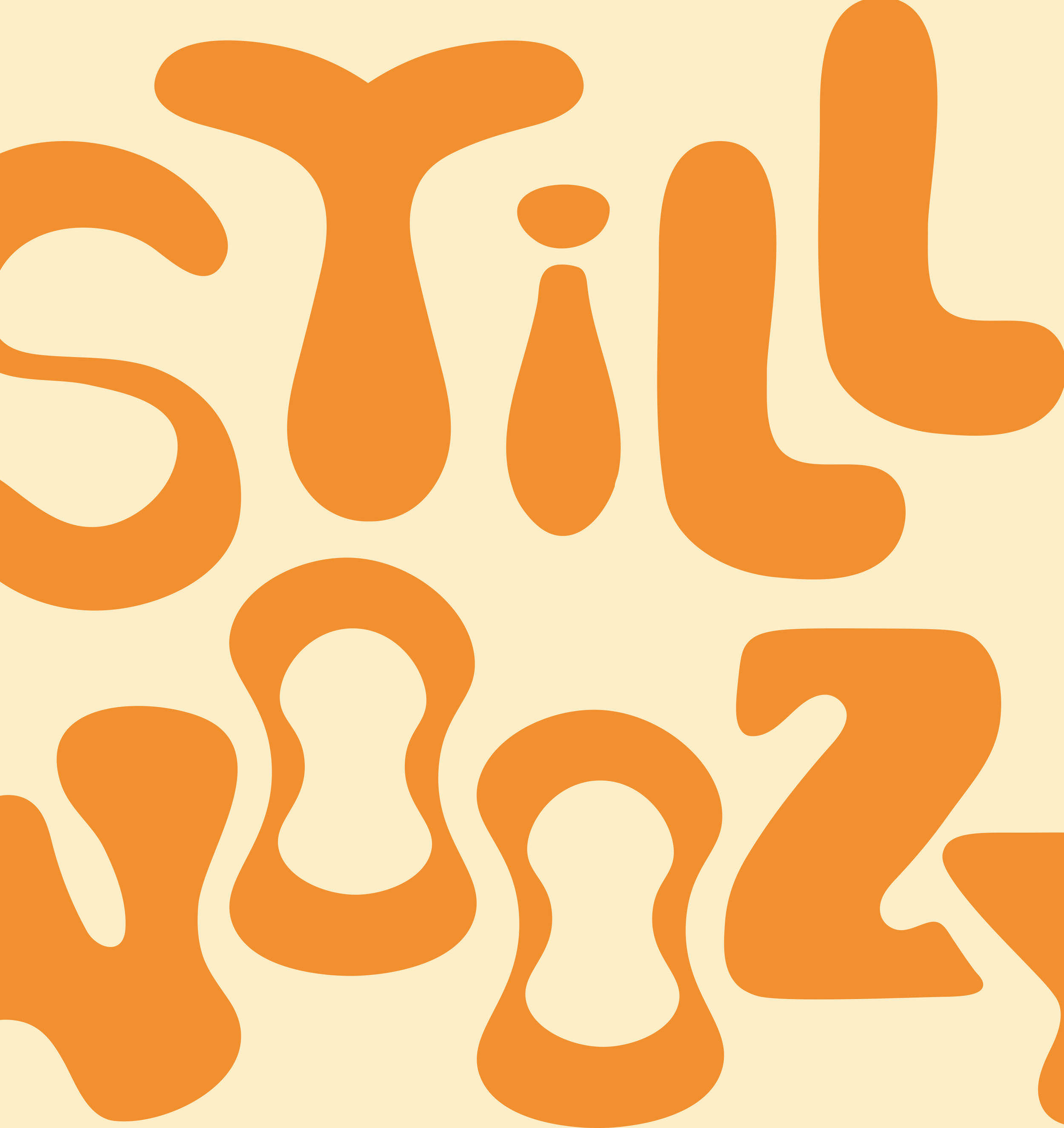
The goal was to design typography that captured Still Woozy’s expressive and slightly quirky style without losing readability or balance. It needed to feel true to the artist’s sound while blending naturally into the visual world of the album.
VISUAL IDENTITY
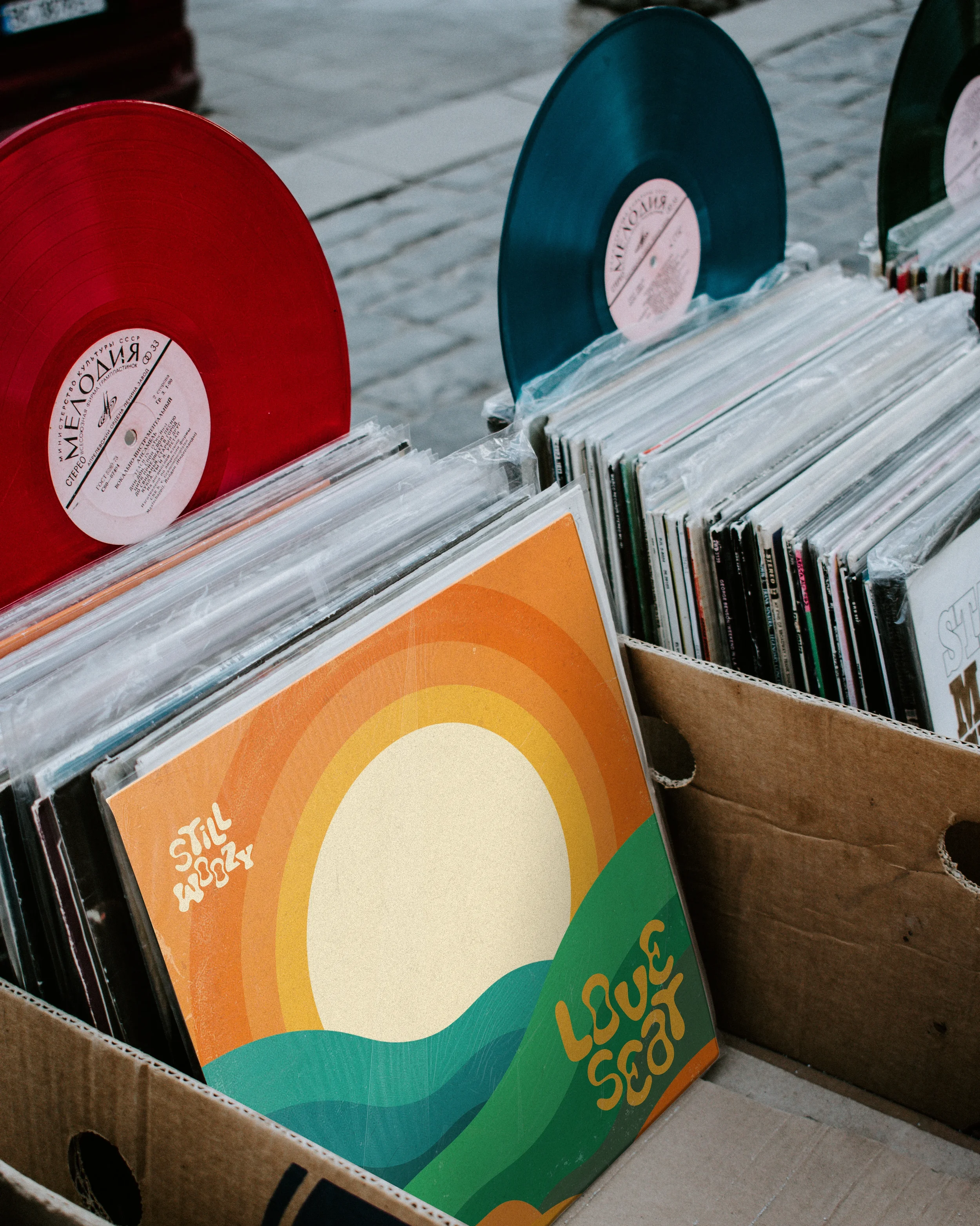
PACKAGING
